
 Posted By
Bajarangi soft ,
Posted On 30-09-2020
Posted By
Bajarangi soft ,
Posted On 30-09-2020
1.CSS Linear Gradient Color
<!DOCTYPE html>
<html>
<head>
    <style>
        #grad1 {
            height: 200px;
            background-color: red; /* For browsers that do not support gradients */
            background-image: linear-gradient(to bottom right, red, yellow);
        }
    </style>
</head>
<body>

<h1>Linear Gradient - Diagonal</h1>
<p>This linear gradient starts red at top left, transitioning to yellow (at bottom right):</p>

<div id="grad1"></div>

</body>
</html>
<!DOCTYPE html>
<html>
<head>
<style>
#grad1 {
height: 150px;
width: 200px;
background-color: red; /* For browsers that do not support gradients */
background-image: radial-gradient(red, yellow, green);
}
#grad2 {
height: 150px;
width: 200px;
background-color: red; /* For browsers that do not support gradients */
background-image: radial-gradient(circle, red, yellow, green);
}
</style>
</head>
<body>
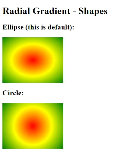
<h1>Radial Gradient - Shapes</h1>
<h2>Ellipse (this is default):</h2>
<div id="grad1"></div>
<h2><strong>Circle:</strong></h2>
<div id="grad2"></div>
</body>
</html>
<!DOCTYPE html>
<html>
<head>
    <style>
        #grad1 {
            height: 150px;
            width: 200px;
            background-color: red; /* For browsers that do not support gradients */
            background-image: repeating-radial-gradient(red, yellow 10%, green 15%);
        }
    </style>
</head>
<body>

<h1>Repeating Radial Gradient</h1>

<div id="grad1"></div>

</body>
</html>